PROBLEM
Benchling provides software for scientists to import and manipulate strings of DNA sequences. An updated version of the DNA editor introduced more functionality for sections of the sequence users designated as "parts", but removed the ability to edit parts. We needed to communicate to users that for parts, editing is not allowed.
SOLUTION
Created appropriate messaging for users to understand the connection between changes in sequence status and ability to edit.
ROLE
UX Designer, Spring 2022
Worked directly with the project manager and engineering team to define, develop, and deliver a decision based on existing problem discovery.
Background
"Parts" are a special class of entities in Benchling that help scientists give meaning to their DNA sequence. They are quite useful when working with an otherwise meaningless string of As, Ts, Cs, and Gs. Users turn to parts for the following reasons:
Groups working on target sequences together like to use parts to keep information in sync and preserve data integrity across the team. If you've ever used components in Figma, you can think of parts in Benchling as similar — both make sure the atoms that make up a larger item stay the same across the project for cohesion.
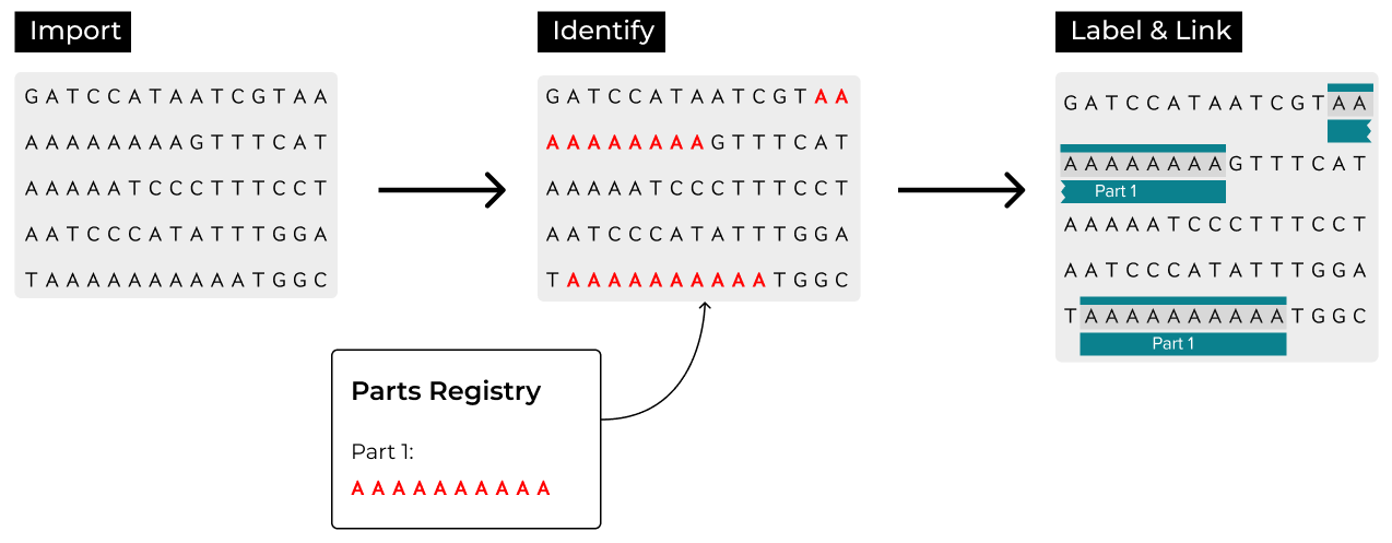
First, a scientist imports a sequence of DNA they want to work with. Then, the scientist uses "Autofill Parts" to let Benchling automatically identify sections of the imported sequence that match sequences in the parts registry. Finally, the identified part is labeled and linked to all other instances of that part. The scientist can choose to unlink the part if they wish to change that section of the DNA.
A key product update removed the ability to make changes to parts in the DNA editor, and we needed to create messaging to communicate this to the user. By iterating with stakeholders, I was able to craft messaging that met my design goals of both continuous communication and maximized user control.

Design Exploration
Previously, anything that appeared in the DNA editor was able to be edited. With the latest software update, DNA labeled as a part was no longer editable.
Engineers put together an interim solution — a yellow toast notification — to communicate the lack of editing capability. However, the yellow toast was physically far away and not clearly associated with the parts designation. It was difficult to understand that the toast was appearing as a result of the user attempting to edit the part.
Furthermore, the yellow toast raised unnecessary alarm — in other parts of the product, the toast is used to alert users when there is an actual error, such as an unsuccessful upload or inability to render a graph. Not being able to edit a part felt much lower on the error hierarchy.
Because the initial solution had been an error toast, I had initially thought about this project as improving error messaging. I realized after stepping through the intended communication and end goal, however, that we were not actually messaging about an error. Rather, we just needed to message about the status of a section of DNA — uneditable. With this new framework, I considered toast alternatives that would indicate status change.
One attempt used a "no entry" symbol associated with the type cursor to indicate no typing. However, this solution was too broad — other click actions, such as click-and-drag to highlight or right-click, are still available. It did not clearly indicate that only editing was unavailable.
A different attempt used what I like to call the "Wordle shake" to indicate the area that would not allow the user to go forward. However, this was jarring, did not follow the movement patterns of the rest of the product, and required the user to guess what was wrong.
The solution I landed on was a tooltip that appears as the user tries to type. It provides explicit guidance for users to diagnose their situation, places the messaging physically close to the area of interest, and implicitly communicates the appropriate degree of urgency — low — to the user.
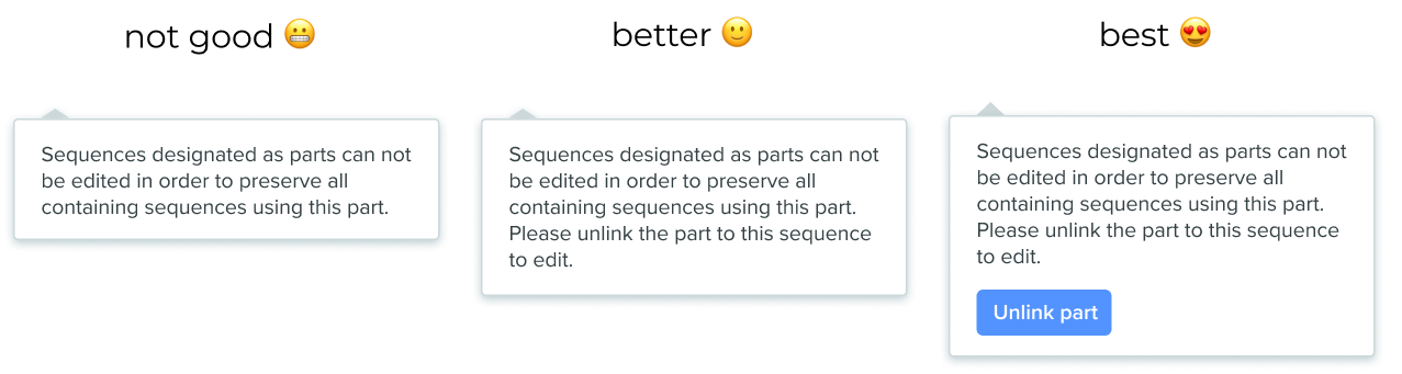
It was fun to explore what message should appear in the tooltip. As a big believer in user control, I felt strongly that the message should not just instruct the user how to edit a section of DNA if they wanted to, but also provide the action needed to actually do it.
Three iterations of tooltip copy: the "Not Good" version explains the restriction but offers no next step; "Better" adds instructions to unlink; "Best" includes an inline "Unlink part" button.
The option with the inline button would provide the most efficient path to the user's end goal. However, adding an "Unlink part" button introduced a significant information architecture challenge: if two parts overlapped, which would be unlinked? Would both be unlinked? Because parts were not originally built with overlapping in mind, the existing infrastructure could not support such an action button. Given time and personnel constraints, we opted to use the "Better" option for now, with the "Best" option noted as a potential future project when DNA parts were next revisited.
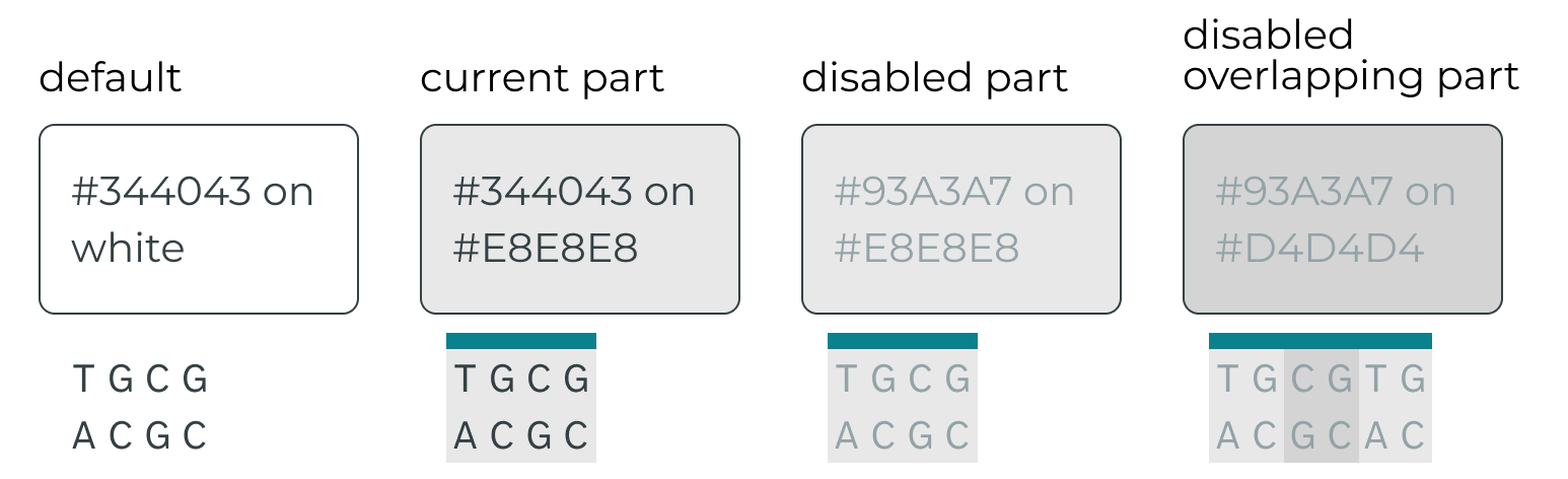
While the tooltip provided reactive messaging, I also wanted to create an "always on" visual indicator to continually remind users that parts were not editable. This would improve users' experience through continuous communication, and avoid the need to navigate through disruptive messaging. A common way of indicating a disabled state is by graying out an item to reduce contrast.
Graying out parts within the DNA sequence tested very well with users. It was an elegant solution — a clear visual cue that some functionality was disabled while keeping the sequence available for copying or other non-editing actions. However, the lowered contrast presented a clear accessibility challenge for users with low vision. This was doubly a problem wherever parts overlapped, as the contrast continued to lower.
The default Benchling text (dark gray on white) passes accessibility contrast checks. Adding a gray part background and then lightening the text to indicate "disabled" fails — and the problem compounds when parts overlap, making the text nearly unreadable.
Designing for inclusion is important because we want everyone to be able to use Benchling. Improving usability for users with low vision also increases general usability for all. With that in mind, I turned to a different "always on" visual cue.
The blinking cursor changes to a non-blinking cursor when clicked into a part, providing a subtle reminder that there is a change of status and editability in these specially designated areas. For users familiar with this functionality, the cursor change alone may be enough — but if a user does attempt to type, the tooltip appears to provide more explicit messaging.
Altogether, the messaging that appears when a user attempts to edit a part looks like this:
Reflections
This started off sounding like a very straightforward project — the error message felt a little off, and I assumed tweaking the placement or copy would fix it. However, I discovered it wasn't even about error messaging! I really learned the value of going back to fundamentals and asking: "What are we hoping for as an outcome? What steps are necessary to achieve this?" I also didn't have much firsthand access to our target users for this project, so this was a great exercise in piecing together research from Benchling subject matter experts and pre-recorded notes from conversations with users.
As mentioned above, time constraints made adding an "Unlink Parts" action button to the tooltip not possible — for now. Given more time and resources, I would pursue this path. It would require a new set of hierarchies to govern overlapping parts (which one is "on top"? How can you tell?), but I believe it would allow parts to be used much more widely, empowering teams to use them more flexibly and improving data integrity across the product.
Lastly, it was very exciting to be working on parts because most scientists have never thought about DNA sections in this manner before. Introducing a "parts" framework could help scientists approach their experiments differently. However, a valuable learning for me was that with such open space, strong guardrails are necessary to lay the foundation, or you will be met with more confusion than discovery.