The existing solution on other platforms was a full-featured sequence viewer. Benchling and SnapGene both have large, scrollable, interfaces built for primer design and sequence exploration. They're powerful tools for users trying to design, edit, and explore plasmids in their entirety.
APE, a common free DNA visualizer
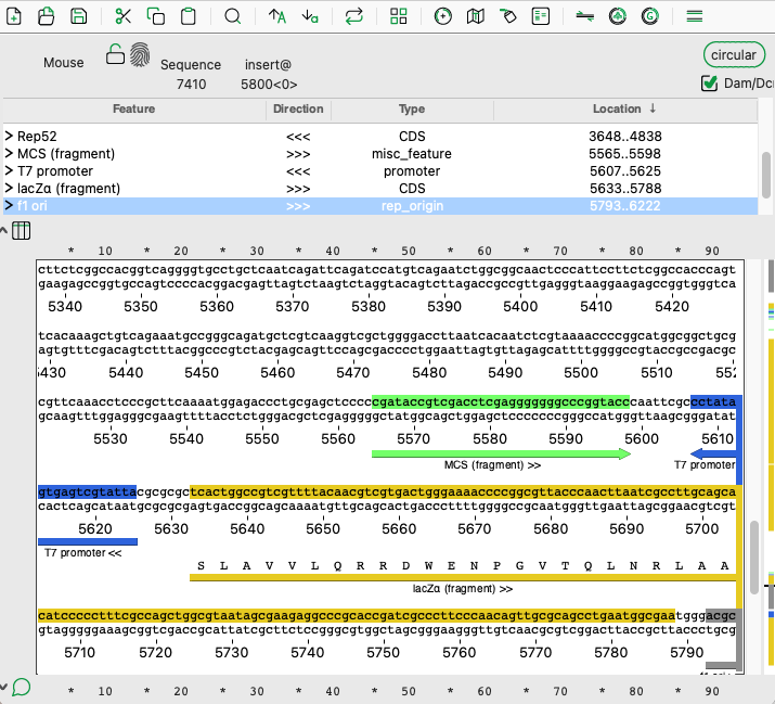
Benchling, an enterprise-level electronic lab notebook that includes a sequence map
An initial sketch of how bases could be shown, along with some sequencing quality information
However, my insight was that our users don't need a sequence explorer. They needed to make a decision about each sample, based on what evidence they had. That distinction drove my design decisions. Rather than build a viewer that puts sequence exploration front and center, I went with a "mini" viewer: a focused, contextual display that surfaces the delta between what they actually had in the tube and what they were intending to build, aka their reference.
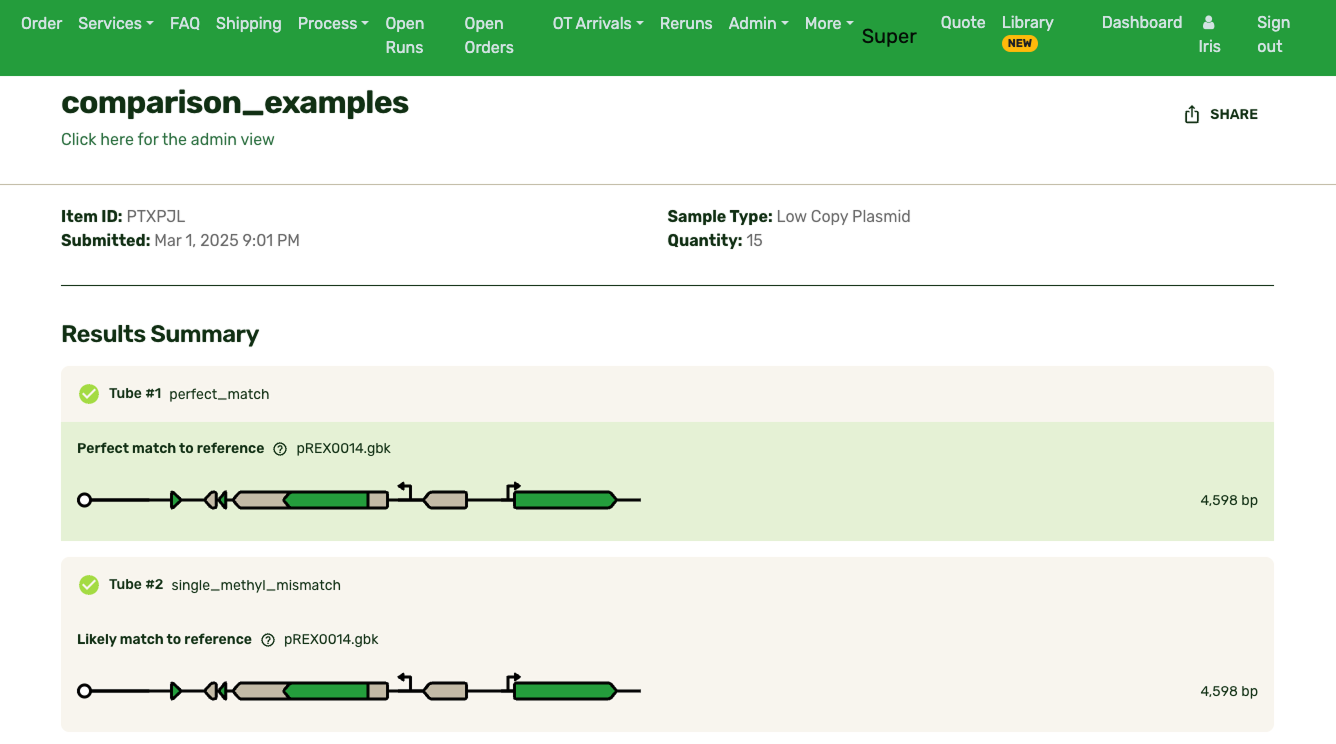
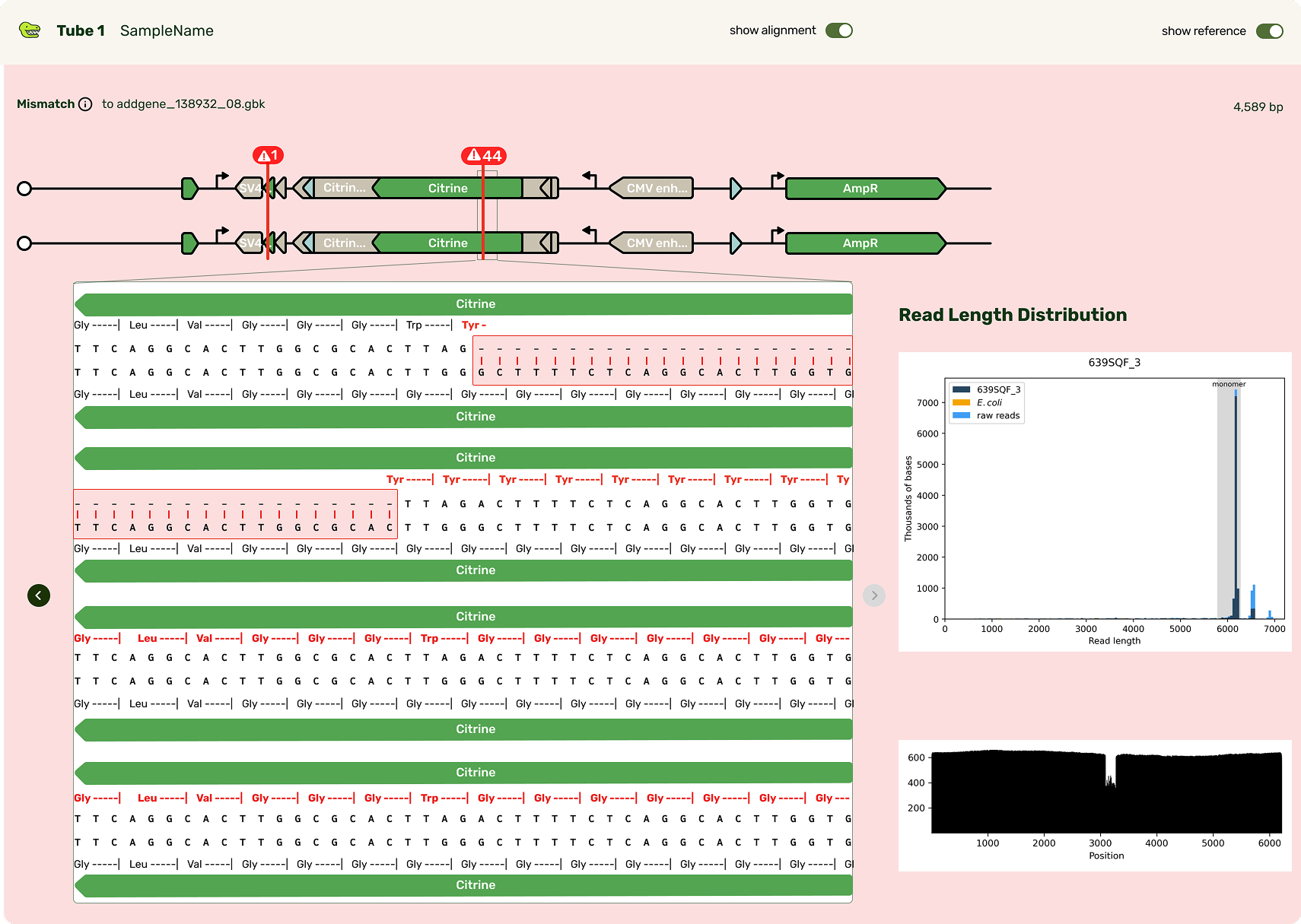
Typically the first question is, "What's different from my reference?" Any mismatches are flagged prominently, and correspondingly highlighted in the base viewer. Users can click through each one to see what mutation occurred. Due to our sequencing technology, some called mutations were likely sequencing artifacts: we marked those separately (in blue) from real mismatches (red) and provided user education on what this meant.
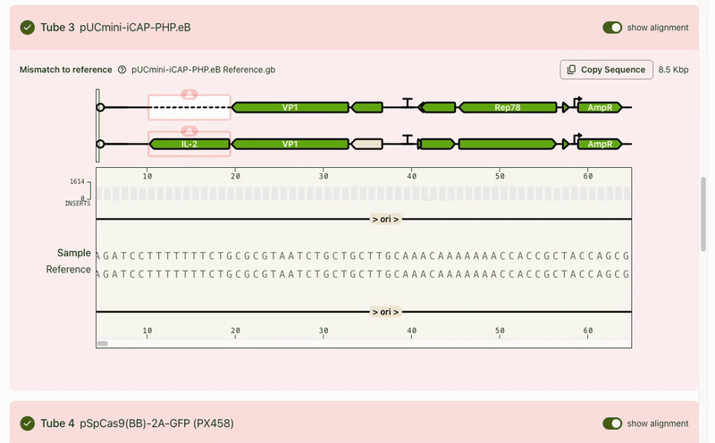
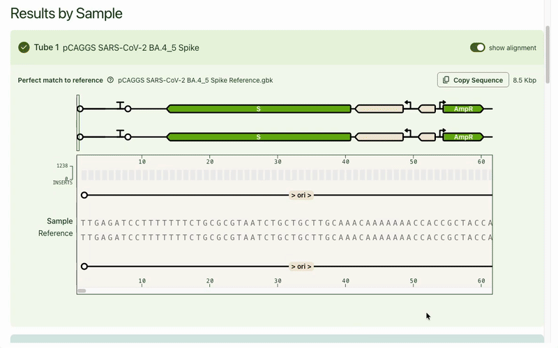
While the focus was on the mismatch areas, it was still important to let people see other parts of the sequence to contextualize the mismatch. A scrollable and scrubbable text string lets users investigate upstream and downstream, as well as copy + paste their updated sequence into their design software.
I also added an amino acid track to show what translational effect a mutation would have. This made it very obvious if a mutation was silent and would have no downstream effect, or if it caused an early stop codon and would have a large effect.
I tucked the sequence quality information as a track above the bases, and showed confidence scores for each base call at each position. It's a lot of information that most scientists don't look for until digging deeper, so I chose to show it only on hover in the visualizer.
The focus on giving users just enough information to make decisions helped me refine the feature set and ensured we weren’t just rebuilding existing tools to be prettier, but giving our users an optimized results experience. The mini viewer was also built with expansion in mind. Plasmidsaurus's motto is to “Sequence Everything,” and base-level results aren't unique to just the plasmid product. As part of my design, I made a bet that we would need to keep reusing this base viewer with product-specific nuances layered on top. Therefore I made a deliberate design decision for the visualizer and its interactions to be agnostic to sequence length, sequence type, and different match conditions.
Expanding the base viewer
The base viewer became a foundational part of the results experience. Users expected to see their sequence at the base level and PMs started speccing new products around that expectation. My bet that the base viewer would become a platform-wide component was validated, especially when our new Genotyping Analysis product was built with the base viewer as a central piece of product differentiation.
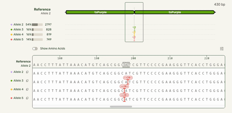
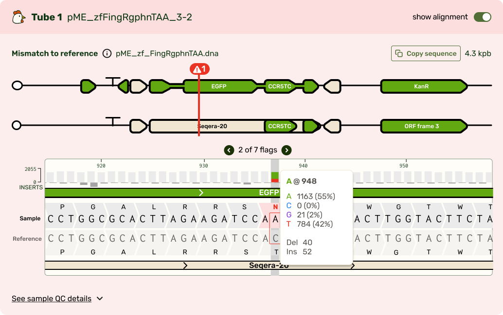
In our Genotyping Analysis product, we run sequencing results through an algorithm that assigns mutations to the right allele.
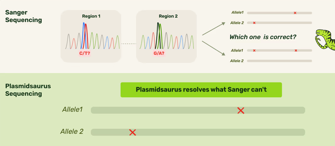
Sanger (an older technology) isn't able to assign mutations to specific alleles. Not only can Plasmidsaurus's technology do that, but we would also visualize it for users!
Tools like Snapgene offer a MSA visualizer, but using it requres entering a separate dedicated flow.
Users wanted to see what distinct alleles made up each sample, and what mutations were seen on each allele. This meant we needed to show each of these alleles stacked up to a reference sequence. Multiple sequence alignment (which can be used outside of an alleles-in-a-sample context) scales exponentially with the number of sequences being compared, causing it to get computationally expensive very quickly. As a result, most other software that have this feature require it be used in a dedicated view.
However, our users had the same end goal: they wanted to make a decision about what samples to move forward with, and moving to a separate interface introduced unnecessary friction. I was able to partner with our engineers who developed a smarter algorithm that handled the combinatorial alignment in a more efficient manner. As a result, I could expand the base viewer to directly show the stacked alleles. I also showed each allele in the full-length preview (above the base viewer) as a track rather than an annotated plasmid map to highlight where the mismatches were:
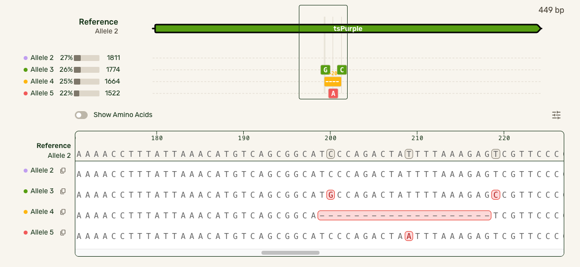
In this much more data-dense version, I introduced some new interactions that cut down on complexity:
- Hover interactions to match allele tracks to the base sequence, and show hidden allele information
- Tooltips to give mutation-specific details
- Turning the amino acid tracks into a toggleable feature
- Making insertions clickable for the user to open and collapse them, preserving the visual continuity of the reference